

Lighter than My Shadow was one of my picks in our 2013 year-in-review podcast. It's the best Sad Comics I've read in a while, and definitely one of the better comics I read last year. It's acute and painful, and sometimes hopeful, and it's beautifully produced and drawn.
 You need to be having a good day to get through it, and even then the odds are fair that it'll make you cry.
Lighter than My Shadow is a a life story in the mould of something like Fun Home or Blankets. It owes a debt to both, and if you want to picture it easily, you could do worse than mentally crash the two together, with a focus on Bechdel's early memories of compulsion disorders. In this case, it's Katie growing up with and slowly working through an eating disorder, sexual abuse, and the resulting trauma. But while that gives you a small measure of tone and theme, it really doesn't go close to either the intensity or the artwork.
The book doesn't take the heavy-handed line that Katie drew herself well again, although it does use a version of that image. Instead, the act of drawing - to recover, to internalise, and to externalise - is one of the refrains it works through its story. Lighter than My Shadow is keenly aware of its status as a world on paper, and uses a movement between paper tones, the tearing of edges, and the degradation of its line to move readers through its emotional and psychological states.
 We begin with clean, simple lines, and tight regimented gutters. They're torn paper edges, but there's a formalism to the arrangement. Colour is carried by the paper tone, and is initially stable and constant. But it doesn't take long (as Katie begins to experience the first difficulties in her relationship with food) for three structuring motifs to appear. The panel arrangement can be disrupted by tears: swathes of the pages that seem ripped through into others, revealing scenes in a different colour palette. The colours often code for era, signifying memories, and the tears can be sharp, often unwanted recollections.
Other times they are jolts of mood, and the most stark shifts of colour are two brief sections,one entirely white, one black.
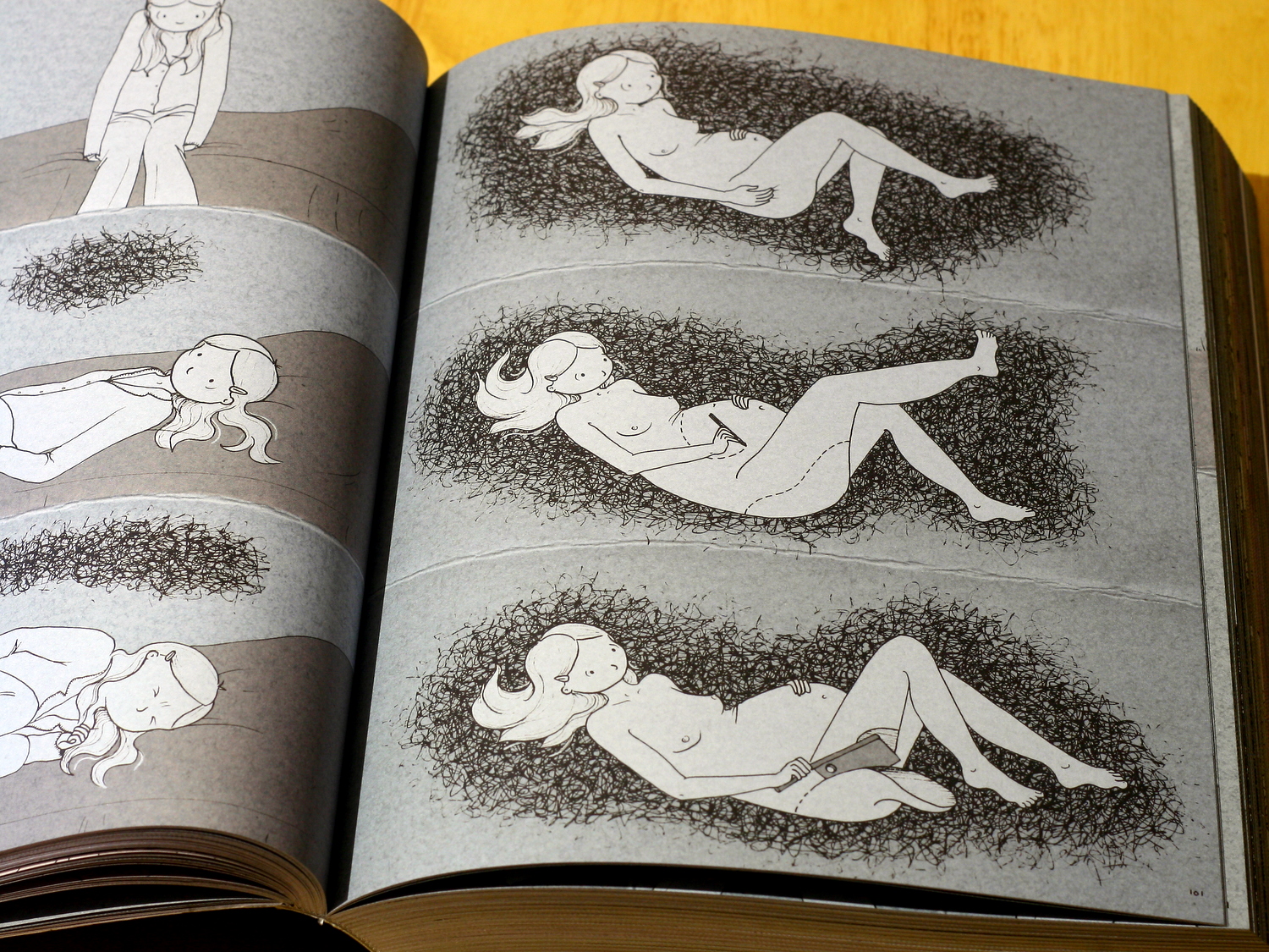
The sheared pages are introduced along with the black cloud - a kind of messy scribble that begins small, and at its most powerful, replaces the gutter and panel structure entirely. It's an externalisation of Katie's illness, but it's also an incredibly precarious visual metaphor, running a phenomenal risk of cliché. What saves it is the intensity and versatility.
 It moves around Katie, figuring for food, mood, traumatic memory, even inspiration. In phases, she visually pulls it into her pencil, externalising it again the same way. At its most savage, it surrounds her, replacing the paper reality with scratchy inkwork, and holding her suspended.
You could argue, I think, that the comics structure of regimented panels and clear, factual representation is a kind of control mechanism, not unlike the young Katie's compulsive behaviours. The torn edges and dependency of the colour palette on the underlying paper tone then begin to look like little nods and winks about the fragility of this structuring of the world.
There are scenes where imagined paper cut-out monsters creep in from the gutters, and this is not unlike the ripping of the pages pushing us between eras of memory. In turn, Katie herself can disrupt the world-on-paper by drawing on it. This third device is introduced early and used more sparingly. It's the one distortion of the world that she can control, and the only thing apart from the rips and the ink cloud that can disrupt the panel structure. When it's used, clearer lines on flatter backgrounds flow out from her pen in gentle curves. The newly-drawn worlds obscure the panels as the cloud can, often in a meandering swirl that picks up the recurring garden-path image.
These structures come together to tell us a wonderfully, painfully, non-simplified recovery story. A young girl struggles with eating, builds compulsions to control her life, and develops anorexia. Her recovery is slow, incredibly difficult, and littered with anxieties and relapses. She meets an alternative therapist who seems at first to give her confidence, betraying it as he sexually assaults her. This is not easy reading, and it continues not to be as the trauma of the assault drives further relapse and a suicide attempt.
As she approaches this crisis, we move from the most tightly regimented page of the book - a simple, deliberate, 3x4 grid - to a page that's tearing, not into a new image, but into blank white:

It gives completely:

Then, gradually, she is able to draw:

It doesn't end there, nor does Katie give us a neat, symmetrical moment of realisation and healing. The final quarter or so of the book is a slow but less brittle recovery. She finds both art and ways to manage her illness, but never lets us forget that the paper can change colour, or be scribbled over or torn.
It's beautifully done, and having been through just a little of what she describes, it's immediate and powerful.
What really gets me about Lighter than My Shadow, though, is the way Katie Green suddenly uses whole pages and double page spreads. The assault scene uses the claustrophobic press of the ink cloud obscuring the page to convey a helplessness that's pretty unpleasant to read:

The text bubbles here feel desperate, and the view point forces a reader into an uncomfortably voyeuristic position. You don't want to be looking at this. The cloud recedes slightly as the scene expands, but it follows her and grows as she flees. Another spread uses the torn paper to show the cloud remaining, hovering over her, as time passes. Later, remembering, this is mirrored as an intrusion of those memories:

Lighter than My Shadow isn't perfect. The first half moves a little slowly, and is arguably over long, while the ending is a little compressed, for instance. But what I love about this book is the way it captures particular - often painful - little moments. Those sweeping spreads of Katie's distorted body vision are only part of it. There are quieter, smaller panels that are doing just as much work: a glance at a mirror, the flash of a painfully gaunt collarbone.
It's not always easy to read, and it's by no means a manual for recovery. But it is ultimately hopeful, and it's a beautiful book.
(The NHS provides some resources on eating disorders here, if you're interested and/or affected by any of this.)